
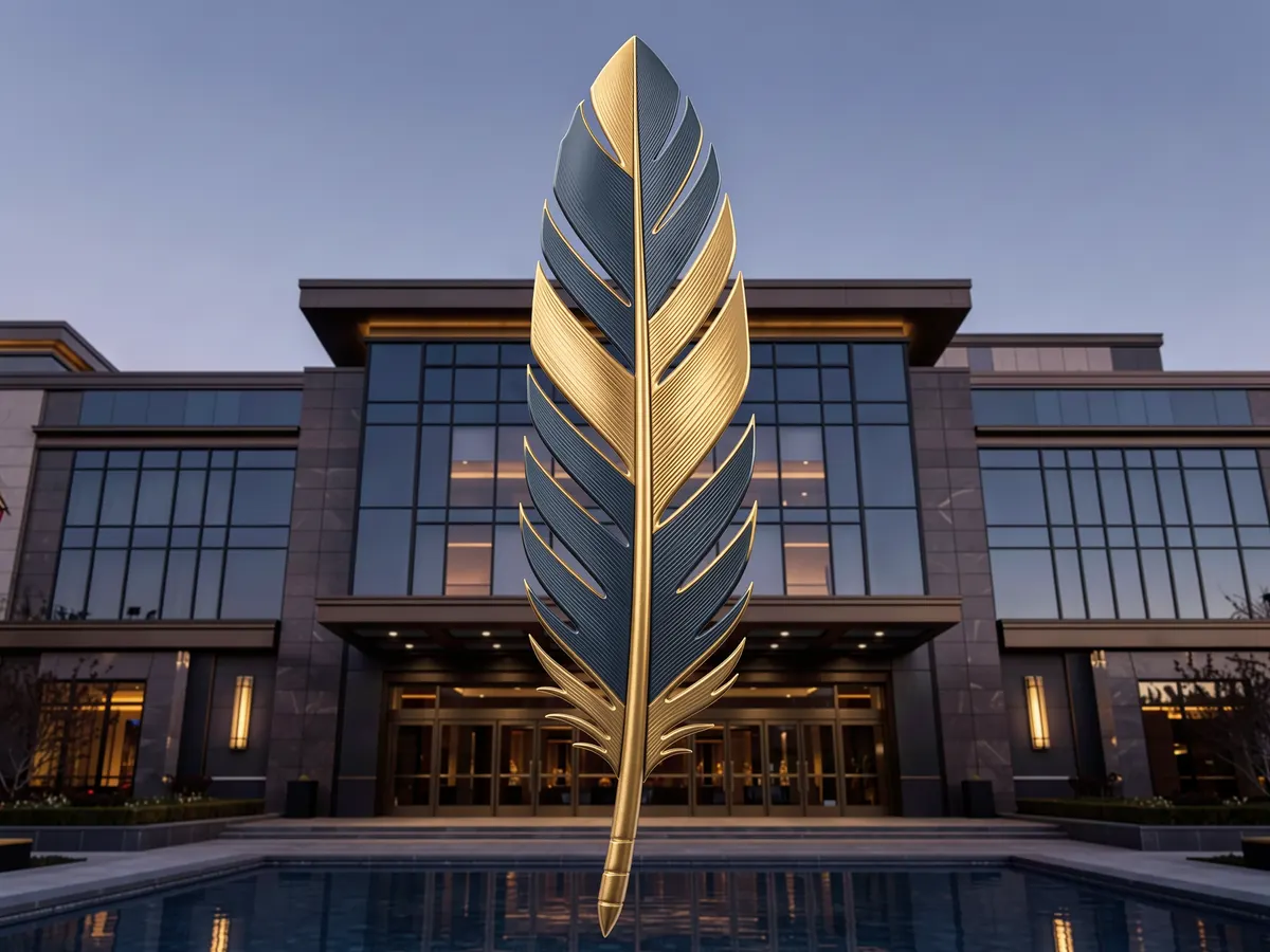
A brand refresh is, on paper, just a new logo. The Seneca casinos rebrand unveiled on September 29 is a single eagle feather pointing skyward, and if you stop there you’ve missed the whole point of the exercise.
Seneca Resorts & Casinos, the gaming and hospitality arm of the Seneca Nation of Indians in Upstate New York, dropped a new corporate identity roughly three months before the company turns 25 on January 1, 2027. The feather is a nod to the gustoweh, the traditional headdress of the Seneca Nation. That is a deliberate choice, and it tells you more about where this operator thinks its competitive advantage lies than any slogan could.
What exactly did Seneca change?
The corporate mark, and the marketing machinery behind it. Not the properties.
Seneca Resorts & Casinos runs three casinos, three gaming rooms and an 18-hole golf destination. The headline assets are Seneca Niagara Resort & Casino, Seneca Allegany Resort & Casino and Seneca Buffalo Creek Casino. Every one of those keeps its existing name and its existing logo. What changed sits above them: the company-level emblem, plus what officials describe as strategic updates to marketing messaging and ongoing work on guest-facing channels, including the Seneca mobile app, the website and social media.
President and CEO Kevin Nephew framed the feather as doing double duty. “The single feather connects directly with our Seneca identity and culture but also signifies that we are always aiming to push the world-class experience we provide our guests even higher,” he said, adding that the company wants guests to “know, feel, and understand the Seneca difference in every aspect of our operation.” The Nation also called the emblem a promise to its millions of guests.
Chief marketing officer Cynthia Liu was blunter about the mechanics: the goal is “continually building trust with our guests and being relatable to them,” before, during and after each visit. That is a customer-lifecycle statement dressed as a brand statement, and it’s the more revealing of the two quotes.
Why a feather, and why now?
Because cultural specificity is the one thing a competitor cannot copy, and because 25 years is the moment an operator either stops being new or starts being old.
Most casino logos are interchangeable: a swoosh, a crown, a stylized initial, something in gold. Anchoring the identity in the gustoweh does something different. It makes the brand mark an assertion of who owns the business. For tribal casino marketing, that’s increasingly the differentiator, especially in markets where commercial operators, racinos and sportsbook apps all compete for the same leisure dollar with broadly similar product.
The timing is the other half of the answer. A 25th anniversary gives a marketing department permission and budget to rework messaging without it reading as a panic move. Rebrands that arrive mid-crisis look defensive. Rebrands that arrive on a round-number birthday look like confidence. Seneca is clearly playing the second card, and the anniversary itself lands on New Year’s Day 2027 — a date you can build a full year of promotional calendar around.
Why keep three property logos instead of consolidating?
Because the properties are not selling the same thing, and Nephew said so out loud.
He described each as having “its own distinct personality,” and the descriptions are specific enough to function as positioning statements rather than filler. Here’s how the company frames its three headline casinos:
| Property | How Seneca positions it |
|---|---|
| Seneca Niagara Resort & Casino | “Big moments and bold energy” — the flagship destination play |
| Seneca Allegany Resort & Casino | A “relaxed escape” with an “intimate feel” |
| Seneca Buffalo Creek Casino | A “fast-paced urban vibe” |
That’s a house-of-brands architecture, not a single master brand, and it’s the right call. Collapsing a Niagara Falls tourist destination, a rural resort and an urban day-trip casino into one visual identity would flatten the exact distinctions that make each one worth a separate visit. The corporate feather becomes the signature on the contract; the properties keep their faces.
Does a casino brand refresh actually move revenue?
Not on its own, and anyone who tells you otherwise is selling design work.
What a casino brand refresh can do is make the rest of the marketing stack cohere. Seneca’s own announcement pairs the logo with app, website and social optimization, which is the honest version of the story: the emblem is the cheap part, the guest-facing digital rebuild is the expensive part. Where it tends to pay off is in the unglamorous metrics — app adoption, email open rates, how quickly a lapsed visitor recognizes an offer as coming from a brand they trust.
One notable absence: the announcement says nothing about changes to the loyalty program or player card structure. For a lot of regular players, the casino loyalty program is the brand relationship — tier status, comps, reinvestment rates. A refresh that updates the logo and the messaging without touching loyalty mechanics is a communications project, not a repositioning. Whether the second shoe drops closer to the anniversary is the thing worth watching.
What does the competitive backdrop look like?
Protected, which is unusual and relevant.
The Seneca Nation holds exclusive rights to slot machines and dealer table games west of State Route 14 in Upstate New York. That exclusivity is the structural reason this rebrand reads as offensive rather than defensive — Seneca isn’t fending off a new neighbour across the street. The competition it faces is for attention and share of wallet: online options, regional travel, entertainment spend generally.
The wider pattern is hard to miss. Seneca unveiled its mark only hours after IGT revealed its own brand makeover at the 2026 Global Gaming Expo — and IGT slot machines sit on the floor at all six Seneca gaming properties. Casino operator rebranding and supplier rebranding are converging on the same instinct: legacy names built in the 1990s and 2000s need identities that survive being shrunk to an app icon.
Worth noting that Seneca’s relationship with renaming isn’t always this enthusiastic. The Nation publicly objected when President Donald Trump renamed Lake Ontario to “Lake America,” arguing the original name derives from Indigenous roots that predate the United States. Which is a useful reminder of the logic underneath the feather: the Senecas are comfortable changing their own mark, and considerably less comfortable with outsiders changing theirs.
What should a player take from this?
Expect a smoother app, more consistent promotional messaging and a year of anniversary marketing running up to and through January 1, 2027. Expect nothing to change about the math. A new logo does not alter RTP, house edge or the odds on any table — branding is how a casino talks to you, not how its games pay. Treat the anniversary offers as entertainment spend, set deposit and session limits before you use them, and use the operator’s responsible gambling tools if play stops feeling like a night out.
The feather is a good piece of design because it says something true about the business. Whether the 25th year delivers more than good design is a question the loyalty program, not the logo, will answer.